
As a designer, one of my main duties is to make complexity accessible. This can be made possible by efficient facilitation. But when communication fails, visuals make sense. That’s why I’ve always found information design and data visualization interesting. When executed successfully, they tell insightful stories. And when not, how can they be improved?
This question led me to design a training program a few years ago at my previous job: how to tell a story via data visualization. It was a nice experience, watching colleagues discover how to pick the right chart and several to consider attributes to improve the storytelling.
My story here isn’t about my interest in data visualization, but in AI tools. Let’s call this a conflict of interest.
The spark came while watching Tina Huang’s YouTube tutorials about building AI tools. In one of them she creates a drawing coach that analyzes her anime sketches and provides feedback to help her improve. As someone who loves drawing and data visualization, I thought: what if I build something similar, but for charts?
That resulted in my first attempt at building an AI-powered app using Lovable: this is how ChartSense came to life.
The learning challenge: making tools play together
The idea was simple: upload a chart, get a plain-language explanation and some tips to make it clearer. But honestly, the idea wasn’t the point. This was really about learning how to use Lovable to build something quickly and stretch my skills.
What I wanted to figure out was how to connect a few different tools so they could work together. One tool to read the chart and explain it, another to explore further the topic, and one to turn the insights into audio. My goal wasn’t to create the next big thing. It was just to see if I could get them talking to each other in one place.
For someone with no coding background, it felt a bit like trying to conduct an orchestra without ever holding a baton. But that challenge was the reason it was worth doing. Every step I took made the whole process feel less intimidating and more exciting.
Starting with a Plan
My first move was creating what I called a PRP (Product Requirements Prompt) for Lovable using ChatGPT. This super-detailed prompt became my roadmap, breaking development into phases. The current version doesn’t even have user accounts activated, but the groundwork is there for future iterations. You may find an excerpt of this at the appendix of this post.
The planning exercise taught me something crucial: having clear use cases and user flows prevents you from falling into the infinite loop of “implement and debug.” It keeps you focused when shiny new possibilities start calling. As Antoine de Saint-Exupéry said, “A goal without a plan is just a wish.”
The technical reality check
Then came the part of making everything actually work, as I want it to work.
The API wake-up call
Uploading my first chart felt like magic, until it didn’t work as expected. My test was a basic line chart, and the AI’s response was painfully generic: “This data visualization displays data with balanced proportions…” It was analyzing visual elements but missing the actual data story. Not exactly the insightful feedback I’d imagined.
Together with Lovable and ChatGPT, we solved it by ditching the original OCR approach and connecting to Gemini’s API to use its built-in vision capabilities.
Mobile-first please
Lovable’s initial suggestion wasn’t mobile-optimized, which meant rethinking the entire upload flow. As a designer, this felt familiar. I used my Figma skills to wireframe the user flow in 5 minutes, upload it to Claude and asked the code for it. And that worked really well!
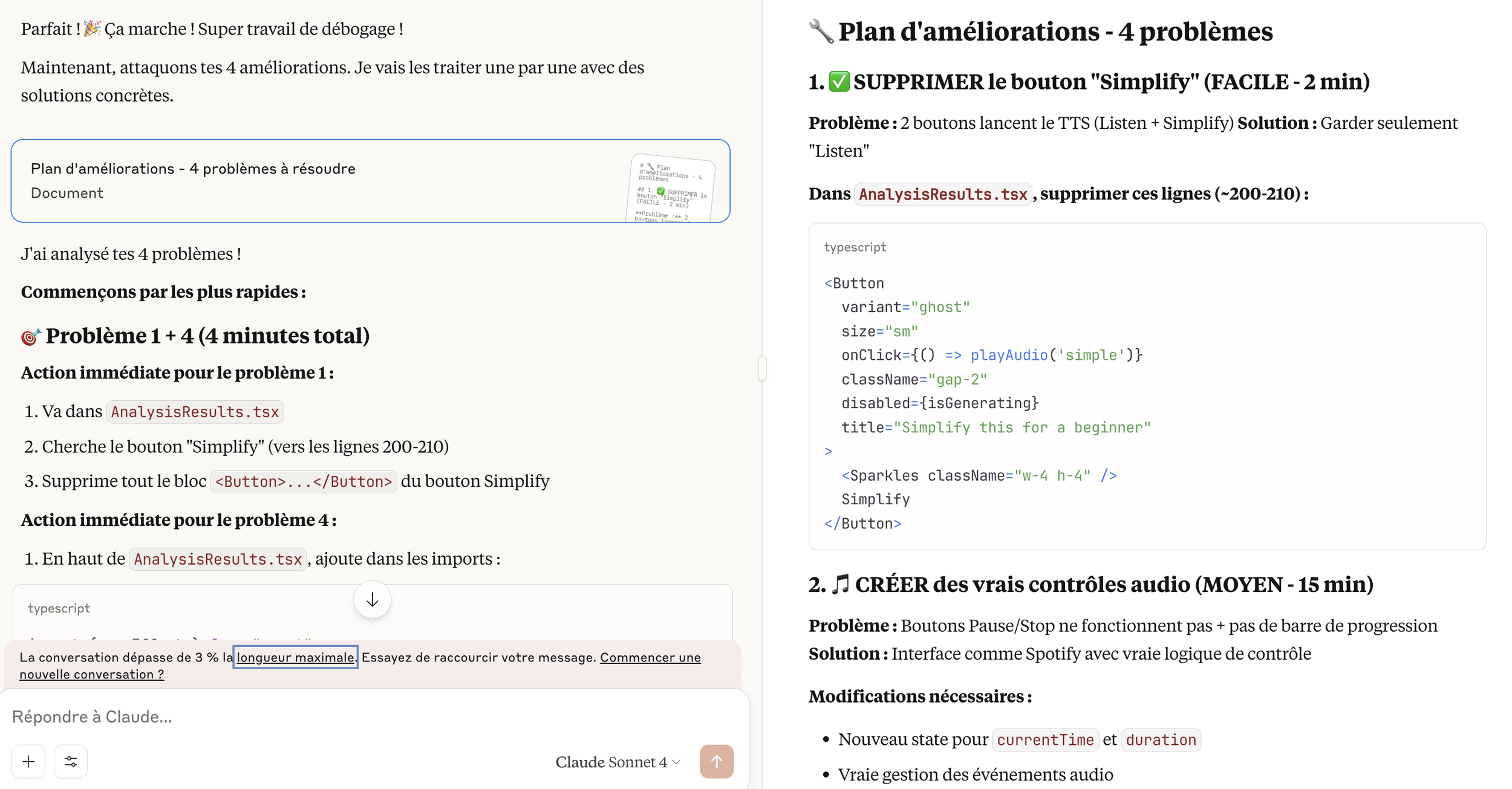
Debugging with Claude
Here’s what debugging with Claude actually looked like. Breaking down complex problems into manageable steps I could actually follow.
The debugging rabbit hole
Here’s where non-coders will relate: debugging can become an infinite loop of “just one more fix.” I figured I was using my Lovable credits like a drunken sailor and I found myself switching to Claude for continued development. Claude felt more empathetic (yes, I’m anthropomorphizing AI tools), guiding me step-by-step through problems rather than assuming I understood complex debugging processes.
But here’s what I learned: each technical challenge taught me that the barrier between designer and developer isn’t as insurmountable as it seems. Every problem solved made the next one feel more manageable.
Finding the Human Voice
After all that technical wrestling, it was time to focus on how it feels to use.
This is where I got genuinely excited. The microcopy started simple, but after creating a style guide with ChatGPT, it evolved into something with personality. The transformation from “Make Data Visual” and “Start analysis” to “Make sense of your data” and “Snap a chart” might seem small, but one feels like work while the other feels like play.
My style guide became: “Our words give data a voice that’s curious, friendly, and a little witty. The tone is playful but never snarky — designed to spark delight, make insights feel human, and keep users smiling.”
I probably over-engineered the microcopy, but that’s where I found the most joy. Every error message, every loading state became an opportunity to inject personality. Prompting ChatGPT to build guidelines and then brainstorming together was genuinely fun.
And hey! When dealing with too many bugs, even I felt better when the app wasn’t saying “auto generation failed” anymore, but rather “The data whispered, but I couldn’t quite catch it. Let’s give it another go.”
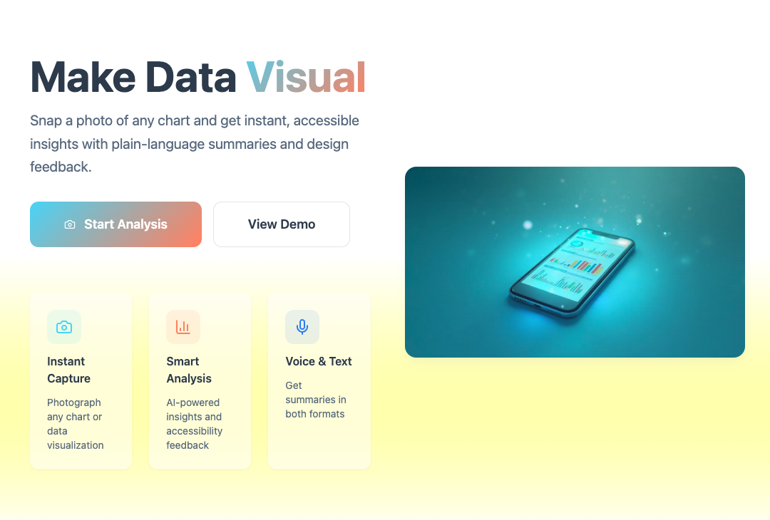

The before human design (left) feels more like a marketing landing page with promotional language, and flashy gradients. The copy is a bit robotic, emphasizing features rather than user value. The after human design (right) is more user-centered: it simplifies the flow with, uses softer tones, and removes the salesy feel. The microcopy is more conversational (“Make sense of your data,” “Hear its story. See it clearly.”), giving the experience a more human touch.
Looking Forward: The Next Experiment
ChartSense taught me that with curiosity, the right tools, and a little patience, you can bring an idea to life much faster than you think. For less than 30 euros and a few hours of work, I had a working prototype that actually analyzed charts, explained them out loud, and even suggested how to make them clearer.
Still, this was only a first pass. My PRP gave me enough structure to focus and ship something real, but if I were treating this like a real-world client project, I’d take the planning a step further and test with real users sooner. So i would start with a Digital Twin model — a complete map of inputs, systems, and outputs inspired by Greg Nudelman’s book UX for AI— then prototype something quick and dirty to test the AI concept. Iterate on that, and then jump to good-old design decisions like style guide and microcopy.
That’s where I’ll pick up in my next post: sharing the Digital Twin I created (with a little help from AI role-playing as my team) and how it could have guided me if ChartSense was a real life project.
Appendix: The Product Requirements Prompt
For those interested in the detailed planning approach, here’s an excerpt of the PRP I used with Lovable:
Product Name: ChartSense
One-Sentence Idea: A mobile app that lets users snap a photo of any data visualization and instantly get accessible, plain-language summaries and design feedback.
Core Features (MVP):
Upload/take photo of chart
Automatic chart type detection + plain-language summary
Voice + text output
Accessibility & design critique
Future Features:
Fact-checking via Perplexity API
User accounts and saved analyses
AI-generated improved charts
Target Audience:
Students & casual learners seeking clear data interpretation
Designers wanting accessible, effective charts
The full detailed version guided every development decision and kept me focused on what really mattered.